Discover Bank — Checking: Online Account Opening + Features
The project goal was to transform Discover's Cashback Debit Checking Account app and browser account application into a next-gen targeted experience. This meant bringing the application to native mobile app for the first time.

Date
2021 — 2025
Role
• Led end-to-end UX flows for mobile and desktop onboarding • Contributed to UX and UI design of product features for mobile and browser • Partnered with research and copy to quantify enhancements and validate content
Company
FCB Chicago for Discover Banking Client
Key Findings
• Cashback Debit had a 65% increase in account openings year of year / 70% new customers • Nerdwallet 2025 winner for Best Online Banking Experience Overall
Problems
Discover Bank wanted to increase account opening conversions in 2021. The Cashback Debit Checking Account application needed a full strategic and UX overhaul to meet evolving user expectations and brand standards.
Outdated Design System: The existing experience relied on a mix of outdated design systems. The project focused on unifying the experience within Discover’s latest design system and brand guidelines to enhance UX, accessibility, and tone—introducing a friendlier, more supportive voice.
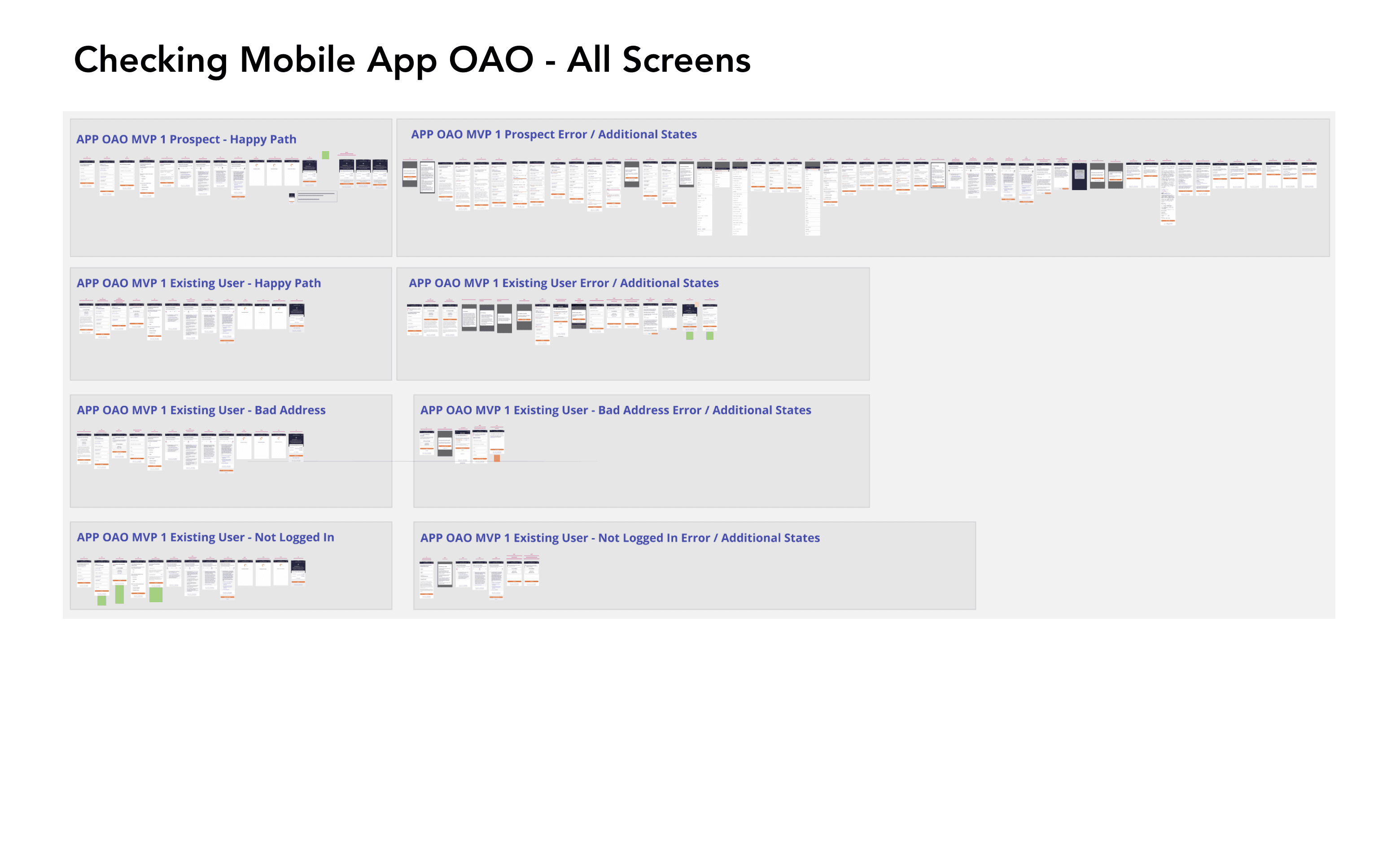
Lacking App Sign-Up: This was the first mobile app application for new users and only the second for existing ones, requiring a mobile-first reimagining of the account flow.
Competitive Pressure: Neobanks lead in app-based account openings and simplified onboarding. One-third of banking leaders now offer in-app checking sign-ups (Curinos). We had to balance ease of use with Discover’s stronger security and compliance needs. In addition, the neobanks, such as Chime, offered a very comepetive feature set.
Gen Z Audience: The experience had a new audience tailored to younger users—many new to banking—focusing on clarity, trust, and personal relevance.
Solution
This was a full mobile-first redesign of the checking account application experience. A new in-app flow was built for both prospective and existing users, with the browser version rebuilt to align with updated UX patterns and the new brand system.
The browser experience now begins with a visually branded entry screen that features the Cashback Debit card and account benefits—helping to reinforce key messaging and maintain continuity from marketing to application.
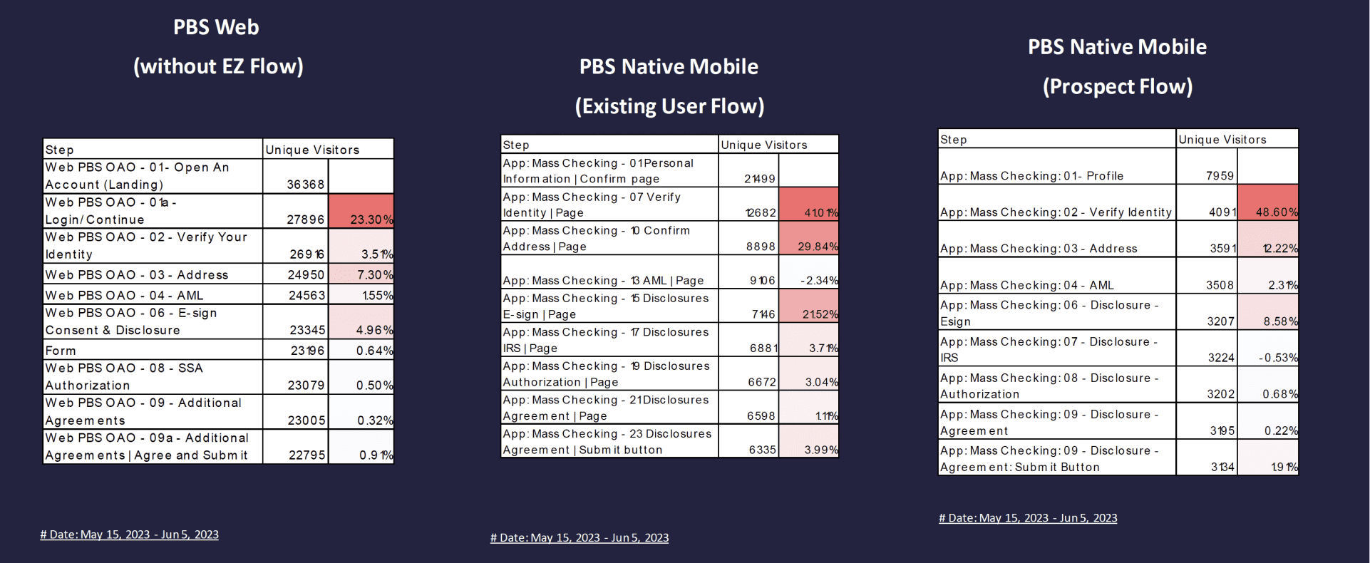
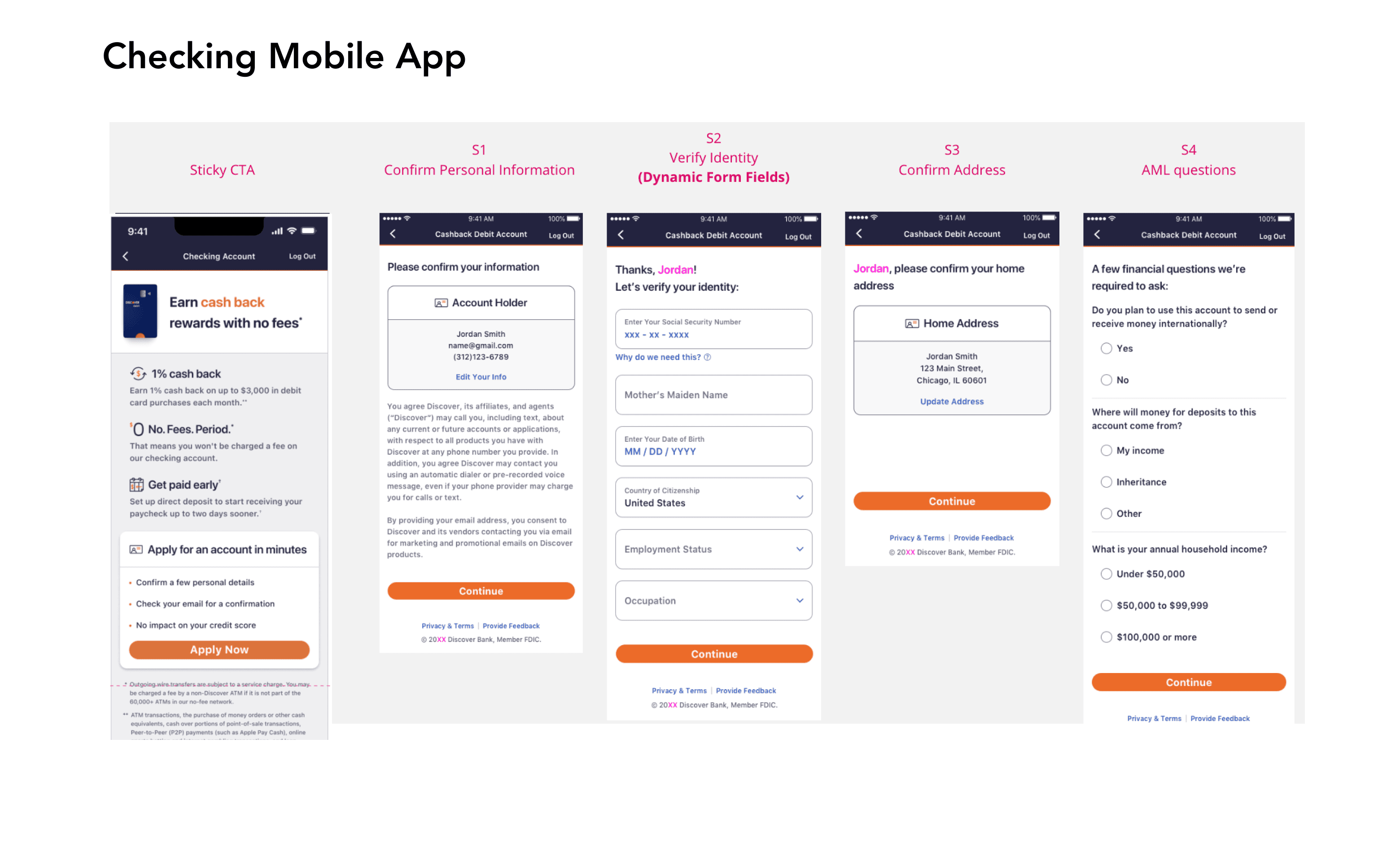
The form experience was restructured based on research into optimal data collection patterns, field grouping, and progress indicators. Application steps were reorganized into distinct pages to reduce cognitive load and improve clarity—focusing on trust, simplicity, and mobile usability.
Post-application tasks, such as account funding, were removed from the flow and shifted to the Bank Account Center. New users are now guided by an Onboarding Checklist—a lighter, more flexible approach that supports continued engagement after signup.
Analysis
While user behavior data—such as page drop-off rates—helped inform some improvements, the broader goal of this project was to lay the foundation for a scalable, enterprise-level application experience.
This wasn’t just about optimizing a single product flow—it was about creating repeatable components, flexible architecture, and shared patterns that could be used across Discover’s suite of banking products.
Some of the foundational features and enhancements included:
A new application framework adaptable to other account types (e.g., savings, CDs)
A redesigned PII collection pattern with privacy features like masking and field confirmation
Onboarding checklist infrastructure designed to support multiple product types post-signup
Collaborative CRO testing with Dentsu to refine headline and CTA copy, informing future templates
These decisions were made with an eye toward future-proofing the experience, enabling other Discover teams to plug into a consistent, branded, and compliant application flow without reinventing the wheel.
These changes are part of an ongoing feedback loop as the redesigned experience continues to roll out and gather performance data.

Result
The rebranding and redesign of the Cashback Debit Checking Account experience strengthened Discover’s position in the market and set a foundation for scalable digital growth.
Brand & Experience Impact
Cashback Debit became Discover Bank’s hero product, supported by a fully refreshed application flow and updated brand voice. The redesigned journey now sees over 60,000 monthly visitors, with nearly quarter using the new in-app experience. Ongoing performance reviews continue to inform UX enhancements.
Expanded Feature Set
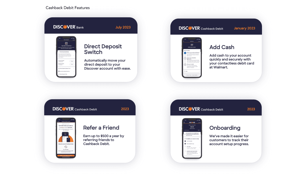
The project enabled the rollout of key product features, including:
Refer a Friend
Add Cash at Walmart
Early Pay with Direct Deposit
Onboarding Checklist
These additions expanded the product’s utility and positioned the app for continued engagement and customer growth.
Additional app and browser features built for the Cashback Debit Checking experience:
🌳 Takeaways
This project was a major learning experience!
I gained a deeper understanding of how web and mobile app experiences differ — especially in terms of entry points and content strategy. The web allowed us to incorporate more marketing-driven and visually engaging “moments of delight,” creating a richer brand expression.
Since the goal was to connect with a younger audience, every design choice reflected that focus. It became an exercise in interpreting traditional credit card brand guidelines (hello, orange and navy!) and finding creative ways to flex them to build something that truly resonated.